Start 14-Day Trial Subscription
*No credit card required

Bell's Unveils Branding and Logo Refresh

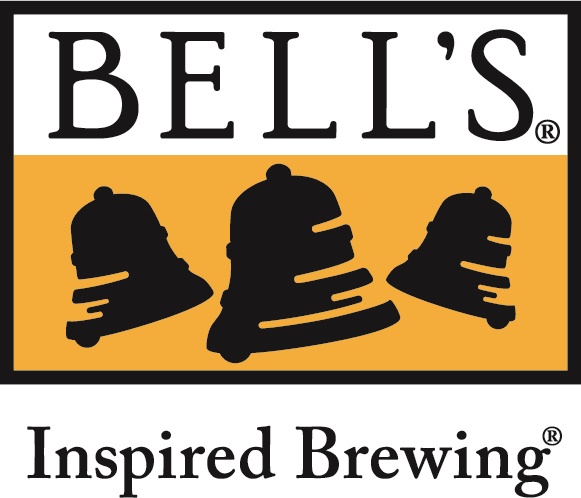
With a flurry of announcements and news, Bell's Brewery has been very busy in 2016. That trend continued when it announced a logo redesign and branding refresh. While the changes are minor, it is a sleeker and more stylish look for one of America's most storied craft breweries.
For specific beers, the style has been foregrounded, giving potential buyers more information about what characterstics the beer will have before they purchase.
The classic Bell's logo has also been given a modern redux, smoothing out the design of the Bell's bells and changing the font to a more eye-catching typeface.
Here is the release from Bell's:
MARCH 29, 2016 -- For more than 30 years, Bell’s Brewery has focused on brewing beer that follows the vision of its President and Founder, Larry Bell.
Bell’s dedication to quality begins with sourcing the finest raw ingredients and continues into the brewhouse, the quality lab, all the way to your glass. It is continuously adding to, and refining its process in every aspect, to ensure and reinforce those expectations of quality.
“As we continue to brew the best beer we can, we wanted to make sure our packaging reflected the quality of the beer inside,” said Bell’s Vice President Laura Bell.
Over the past year, Larry Bell and Laura Bell, have been working with a team at Kaleidoscope to look at the imagery of each member of the Bell’s family of beers.
“We wanted to make sure our packaging and logo maintain the heritage and vision of our brands while highlighting the style of each beer, in a way that is consistent with who we are as a brewery,” Larry Bell said.
Today, Bell’s is very excited to share a first look at its new logo and packaging before both begin to roll out later this year.
The Bell’s logo is changing to better reflect the Bell’s name and the branding it is so proud of. Certain brands will also change to highlight the flavor and characteristics of the beer inside.
“We are incredibly thankful to the artists who created the iconic art featured on so many of our brands. They have helped showcase our creative side and in turn, helped our brewery grow,” Larry Bell said.
Fan favorites, like the Two Hearted Brook Trout and Oberon Sun are not going anywhere. They will actually be displayed more prominently.
While being respectful to those works of art, Bell’s also wanted to pay homage to where it has been. In line with its commitment to quality, Bell’s wanted its packaging to reflect the beer inside by highlighting styles and descriptions more clearly.
“The essence will remain the same. That will always be a part of who we are,” Larry Bell said.
In keeping with Bell’s commitment to sustainability and its environment, these changes will be introduced over time to cut down and eliminate waste.
This is the culmination of 30 years of inspired brewing. Bell’s 30th anniversary and Funvitational were just the beginning of another chapter for the family-owned brewery.
“We’re proud of where we’ve been and are just as excited about where we’re going, something we are excited to share more about in the months ahead,” Laura Bell said.
Images Courtesy of Bell's Brewery


